Brutalism is a design approach that often appears unfinished at first glance, yet delivers a strong and intentional visual impact. In recent years, the term has gained renewed attention in branding, logo design, and digital interfaces, particularly within experimental and editorial design spaces.
In design, Brutalism refers to a style that embraces raw, bold, simple, and intentionally unpolished aesthetics. Rather than focusing on refinement or ornamentation, it prioritizes clarity, structure, and function.
In design, Brutalism refers to a style that embraces raw, bold, simple, and intentionally unpolished aesthetics. Rather than focusing on refinement or ornamentation, it prioritizes clarity, structure, and function.
Origins of Brutalism
The concept originates from architecture, derived from the French term béton brut, meaning raw concrete. Brutalist architecture is characterized by exposed materials, strong geometric forms, and an industrial appearance. These buildings were designed with functionality and structural honesty as the primary goals, rather than visual elegance.
This architectural philosophy later influenced graphic design, web design, and branding, where similar principles are applied visually and functionally.
This architectural philosophy later influenced graphic design, web design, and branding, where similar principles are applied visually and functionally.
Every newsroom needs someone monitoring the wires. In n8n, this starts with the Schedule Trigger.
Why Brutalism Is Used in Modern Design
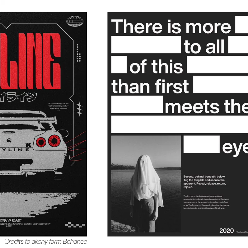
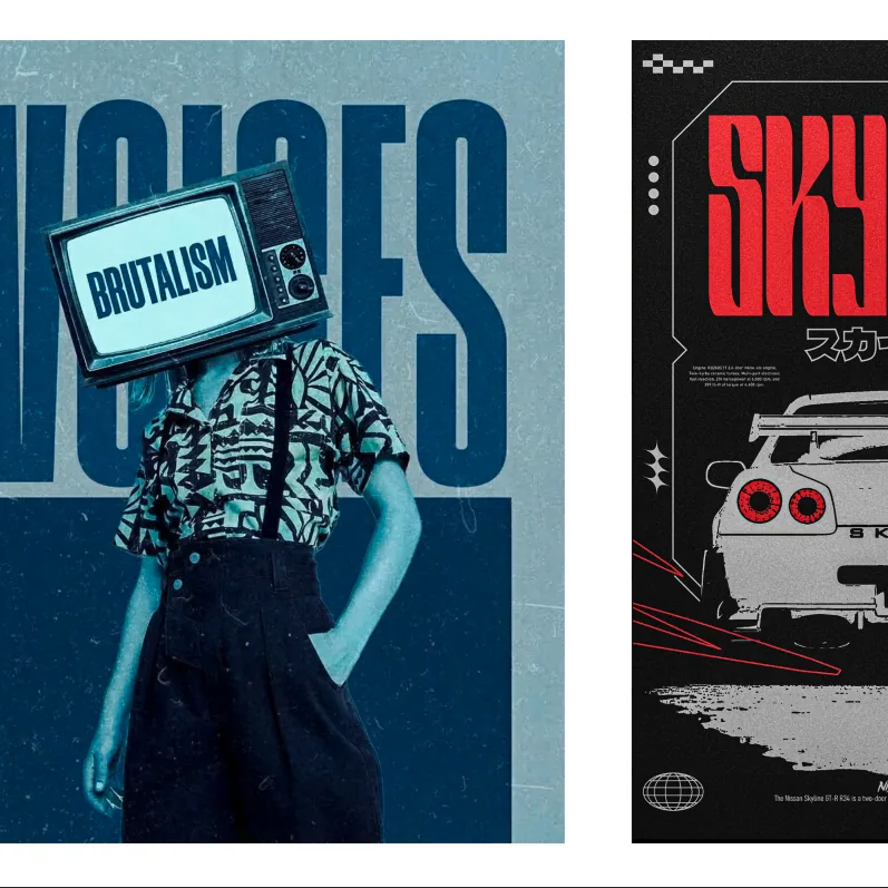
In an era dominated by highly polished visuals, smooth gradients, and decorative effects, Brutalism offers a clear contrast. It champions honesty over decoration and function over aesthetics.
For example, a button designed with no gradients, no shadows, and no visual embellishments—just a clear shape and readable typography—reflects Brutalist principles. This approach communicates transparency, directness, and authenticity.
Many modern brands adopt Brutalism to differentiate themselves, signal creative independence, or convey a bold, unconventional identity. It is especially effective in editorial platforms, creative studios, and experimental digital products.
For example, a button designed with no gradients, no shadows, and no visual embellishments—just a clear shape and readable typography—reflects Brutalist principles. This approach communicates transparency, directness, and authenticity.
Many modern brands adopt Brutalism to differentiate themselves, signal creative independence, or convey a bold, unconventional identity. It is especially effective in editorial platforms, creative studios, and experimental digital products.
Key Characteristics of Brutalist Design
Brutalist design commonly includes:
The objective is not visual roughness for its own sake, but intentional simplicity and structural clarity.
Brutalism in design strips visuals down to their essentials. When applied thoughtfully, it creates clarity, impact, and authenticity. In a landscape saturated with refined and glossy visuals, Brutalism stands out by being unapologetically direct and functional.
- Basic geometric shapes
- Harsh edges and strong, visible lines
- Sharp corners with no rounded elements
- Large, heavy, and often unconventional typefaces
- Minimal use of color and decorative elements
The objective is not visual roughness for its own sake, but intentional simplicity and structural clarity.
Brutalism in design strips visuals down to their essentials. When applied thoughtfully, it creates clarity, impact, and authenticity. In a landscape saturated with refined and glossy visuals, Brutalism stands out by being unapologetically direct and functional.